Wellwish
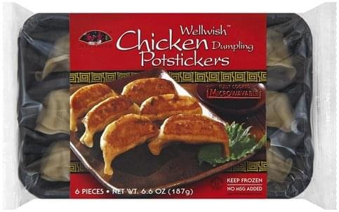
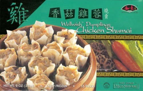
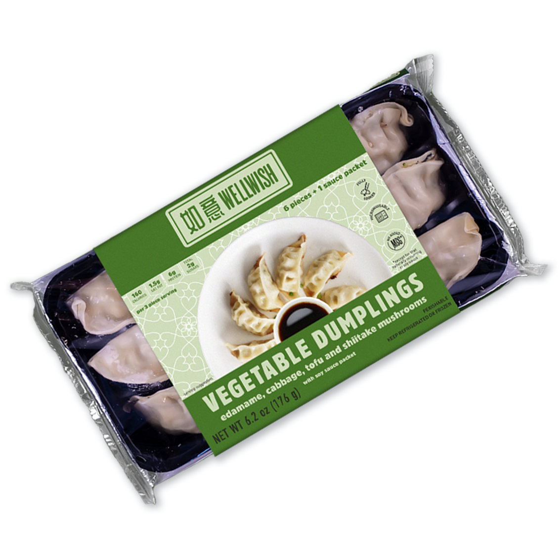
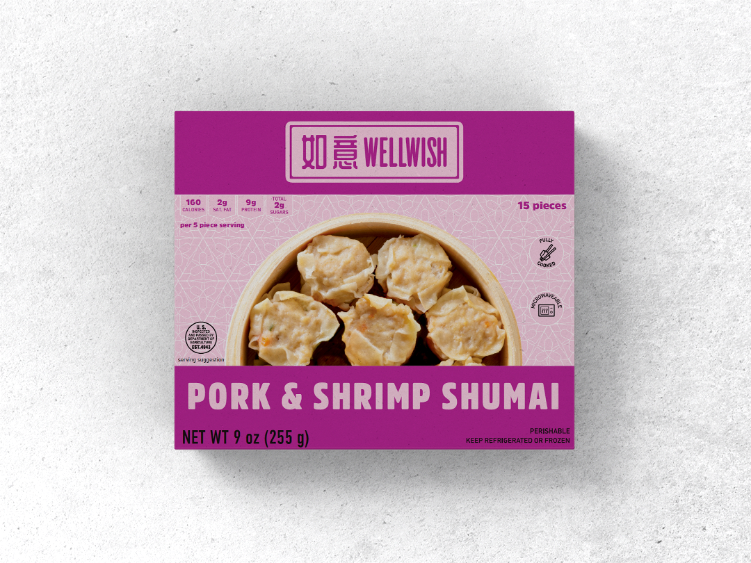
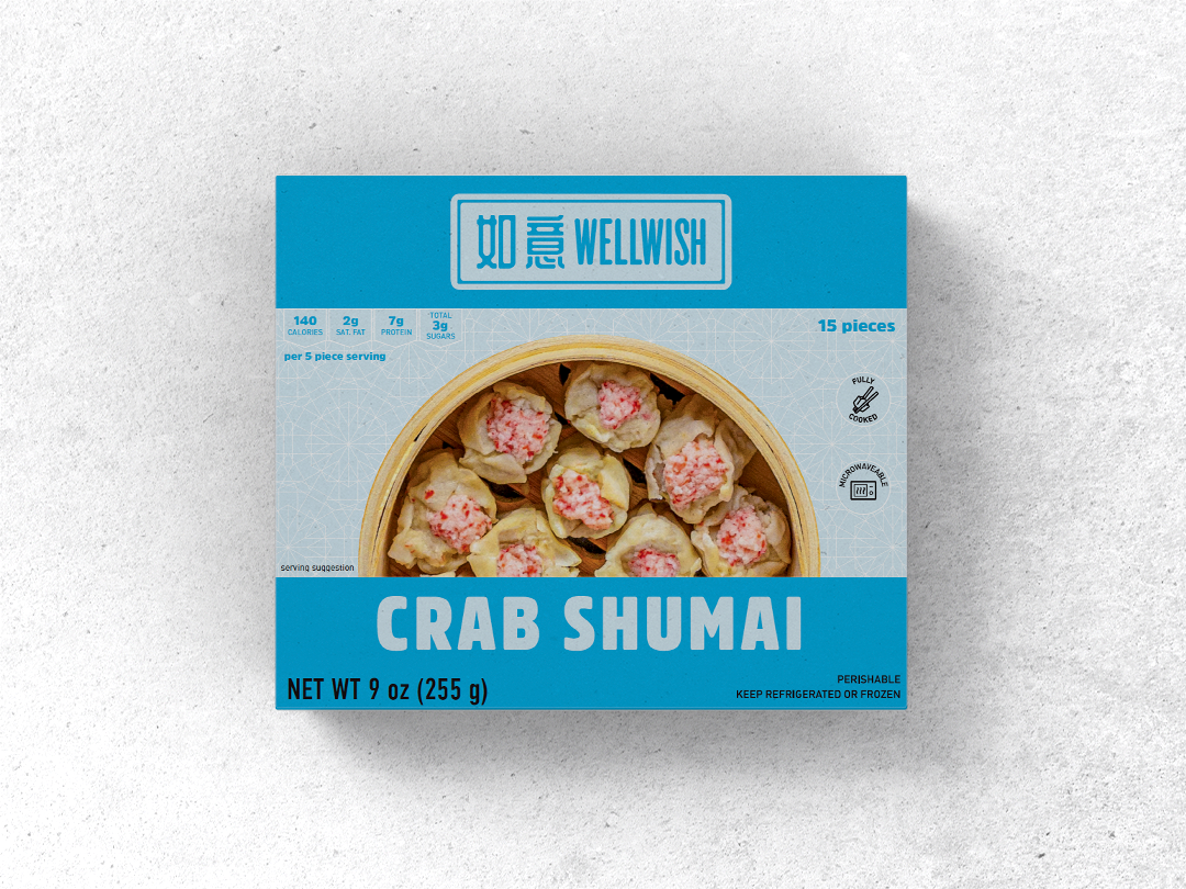
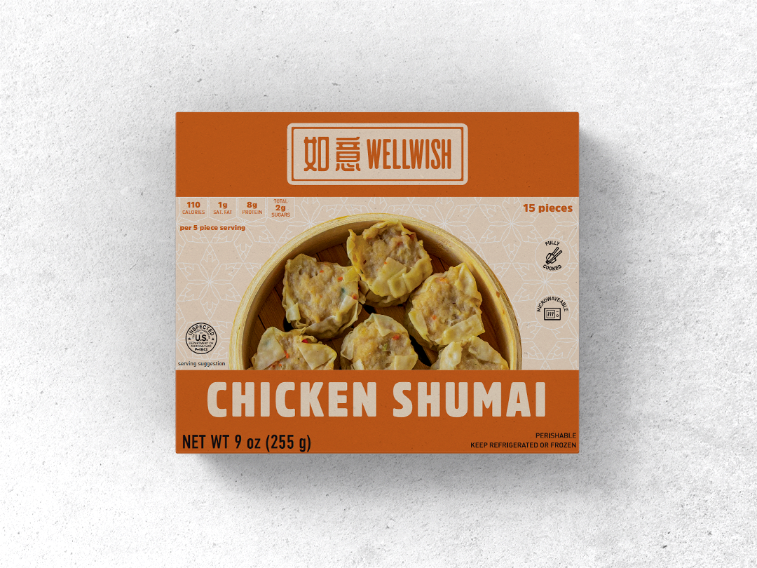
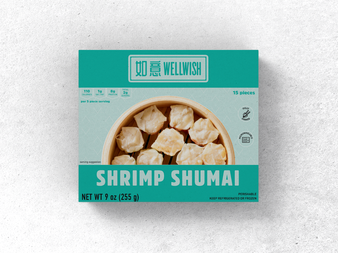
Wellwish makes traditional potstickers and shumai, sold in the frozen food aisle in Asian supermarkets nationwide.
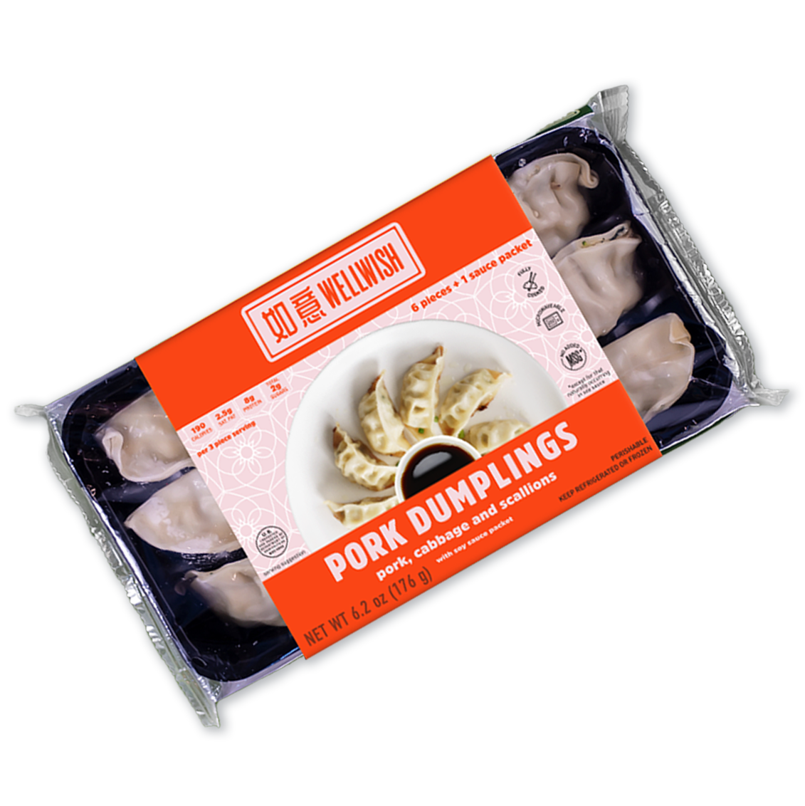
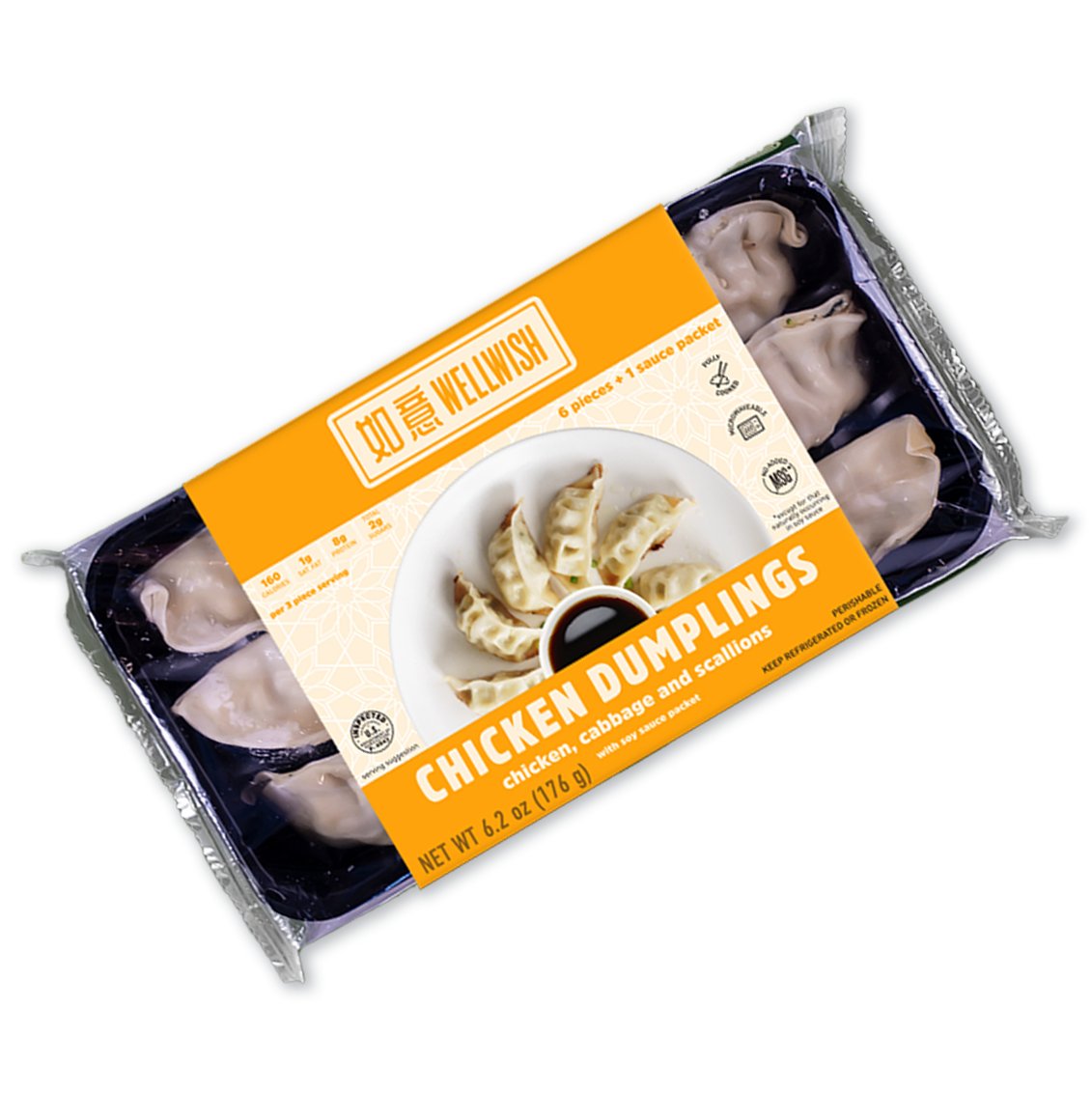
They wanted to update their branding and packaging to modernize the product and standout to a Western audience.
branding | packaging design | web design
Chloe has done great work for all 3 of our consumer facing brands - serving as an extension of our internal team. She has provided a wide variety of design and graphics work for us across a variety of media channels - from digital assets like web design, email newsletters fully integrated through MailChimp to physical assets like packaging and sales sheets. Chloe is extremely responsive, flexible, creative and easy to work with. She gets what I'm looking for, is responsive to feedback and consistently makes my life easier!
Tiffany Yang, Chief Marketing Officer, Shine Foods


